")

Every parent faces the challenge of picking colors that truly reflect their family’s style for a photo shoot in Massachusetts, Connecticut, or Rhode Island. Color choices in family portraits do much more than just look nice—they set the mood and help your family’s personalities shine. By focusing on thoughtful color selection, you can transform an ordinary photo into a lasting memory filled with warmth and connection. This guide offers practical tips for choosing colors that enhance skin tones, suit local backdrops, and bring out the best in every family member.
Table of Contents
- Family Photo Color Basics Explained
- Seasonal Palettes And Their Effects
- Matching Versus Coordinating Outfits
- Location-Based Color Choices And Impact
- Common Color Mistakes To Avoid
Key Takeaways
| Point | Details |
|---|---|
| Color Selection is Crucial | Thoughtful color choices can enhance portrait aesthetics and create visual harmony in family photos. |
| Seasonal Palettes Impact Emotion | Each season offers unique color opportunities that significantly affect the emotional tone of photographs. |
| Coordinating Outfits Enhances Visual Depth | Choosing complementary colors allows individual personalities to emerge while maintaining cohesion across family members. |
| Avoid Common Color Mistakes | Being aware of color pitfalls can prevent unflattering outcomes and enhance the overall quality of family portraits. |
Family photo color basics explained
Color selection plays a crucial role in creating memorable family portraits that capture your family’s essence and style. Understanding color dynamics helps transform ordinary photographs into stunning visual narratives that will be cherished for generations.
When choosing colors for family photos, photographers leverage fundamental principles of color photography techniques, which involve capturing images through red, green, and blue color channels. These technical foundations enable photographers to reproduce natural, vibrant colors that reflect your family’s unique personality.
Key color selection considerations include:
- Complementary color schemes that create visual harmony
- Color depth and saturation levels
- Avoiding overly trendy or distracting color combinations
- Selecting colors that flatter individual skin tones
- Maintaining a balanced, cohesive look across family members
Color interactions are complex and nuanced. Thoughtful color choices can dramatically enhance portrait aesthetics by creating contrast, drawing attention to subjects, and preventing visual monotony. Professional photographers understand that color isn’t just about appearance—it’s about storytelling and emotional resonance.
Strategic color selection transforms family photos from simple images into meaningful visual memories.
Pro tip: When planning family photo outfits, select 2-3 coordinating colors from the same color family to create a harmonious yet dynamic visual composition.
Seasonal palettes and their effects
Family photographs become extraordinary narratives when photographers understand the profound impact of seasonal color palettes. Each season offers unique color opportunities that can dramatically transform the emotional tone and visual aesthetic of family portraits.
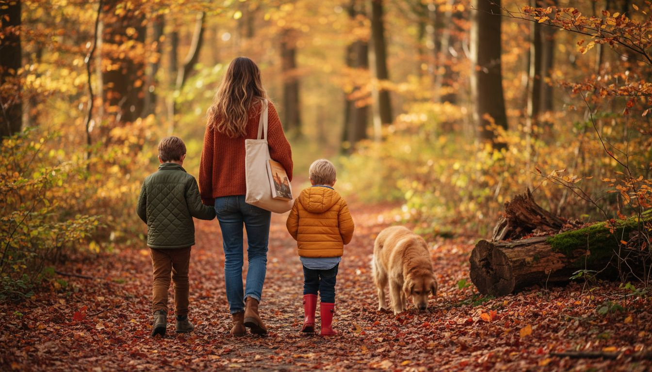
In autumn color photography, warm tones create powerful visual stories that capture familial intimacy and natural beauty. Rich palettes featuring deep reds, burnt oranges, and golden yellows complement outdoor environments and evoke feelings of warmth and nostalgia.
Key seasonal color considerations include:
- Summer: Bright, vibrant colors that reflect natural sunlight
- Autumn: Warm earth tones and rich, deep hues
- Winter: Cool, crisp colors with metallic and soft neutral accents
- Spring: Soft pastels and fresh, light color schemes
Understanding how different skin undertones interact with seasonal color schemes is crucial. Warm skin tones typically look best in earth-inspired palettes, while cool skin tones shine in blues, greens, and jewel-toned backgrounds. Professional photographers strategically select colors that enhance natural complexions and create harmonious, flattering images.
Here’s a summary of how seasonal palettes influence family photo outcomes:
| Season | Typical Palette | Emotional Tone | Ideal Skin Undertone |
|---|---|---|---|
| Summer | Bright, saturated | Joyful, energetic | Cool, neutral |
| Autumn | Warm, rich earth | Cozy, nostalgic | Warm, neutral |
| Winter | Crisp, metallics | Elegant, serene | Cool, deep |
| Spring | Soft, pastel tones | Fresh, rejuvenating | Fair, warm |
Seasonal color palettes are more than aesthetic choices—they’re emotional storytelling tools that capture family memories.
Pro tip: Consider scheduling your family photo shoot during a season that naturally complements your family’s skin tones and preferred color palette for the most stunning results.
Matching versus coordinating outfits
Choosing the right approach to family photo attire can transform a good photograph into an extraordinary visual memory. Family outfit styling requires careful consideration, balancing individual personality with overall visual harmony.
Understanding color coordination principles is crucial for creating stunning family portraits. Professional photographers recommend a strategic approach that goes beyond simple matching, focusing instead on complementary color schemes that allow each family member’s unique style to shine.
Key differences between matching and coordinating include:
- Matching: Wearing identical or extremely similar colors
- Coordinating: Selecting colors that complement each other without being identical
- Matching creates uniformity but can feel staged
- Coordinating allows individual personalities to emerge
- Matching works best with small groups or specific themes
- Coordinating provides more visual depth and interest
The goal is to create a cohesive look that feels natural and authentic. Neutral colors serve as excellent foundational elements, allowing bolder accent colors to create visual interest. Professional photographers typically recommend selecting a primary color palette with 2-3 complementary shades that work harmoniously together.
Compare matching and coordinating outfit strategies for family photos:
| Approach | Visual Effect | Personality Expression | When to Use |
|---|---|---|---|
| Matching | Uniform, consistent | Limited | Small groups, themes |
| Coordinating | Harmonious, dynamic | Highlights individuality | Large groups, variety |
Coordination is an art of visual harmony, not an exact science of uniform appearance.
Pro tip: Select a color palette with 2-3 complementary colors, allowing each family member to express their individual style while maintaining an overall unified look.
Location-based color choices and impact
Photographic locations dramatically influence color selection, transforming family portraits from simple images into narrative masterpieces. Visual storytelling begins with understanding how different environments interact with clothing colors and lighting conditions.
Professionals utilize color scheme methodologies that optimize visual harmony between subjects and backgrounds. Urban, natural, and indoor settings each demand unique color strategies that enhance photographic composition and emotional resonance.
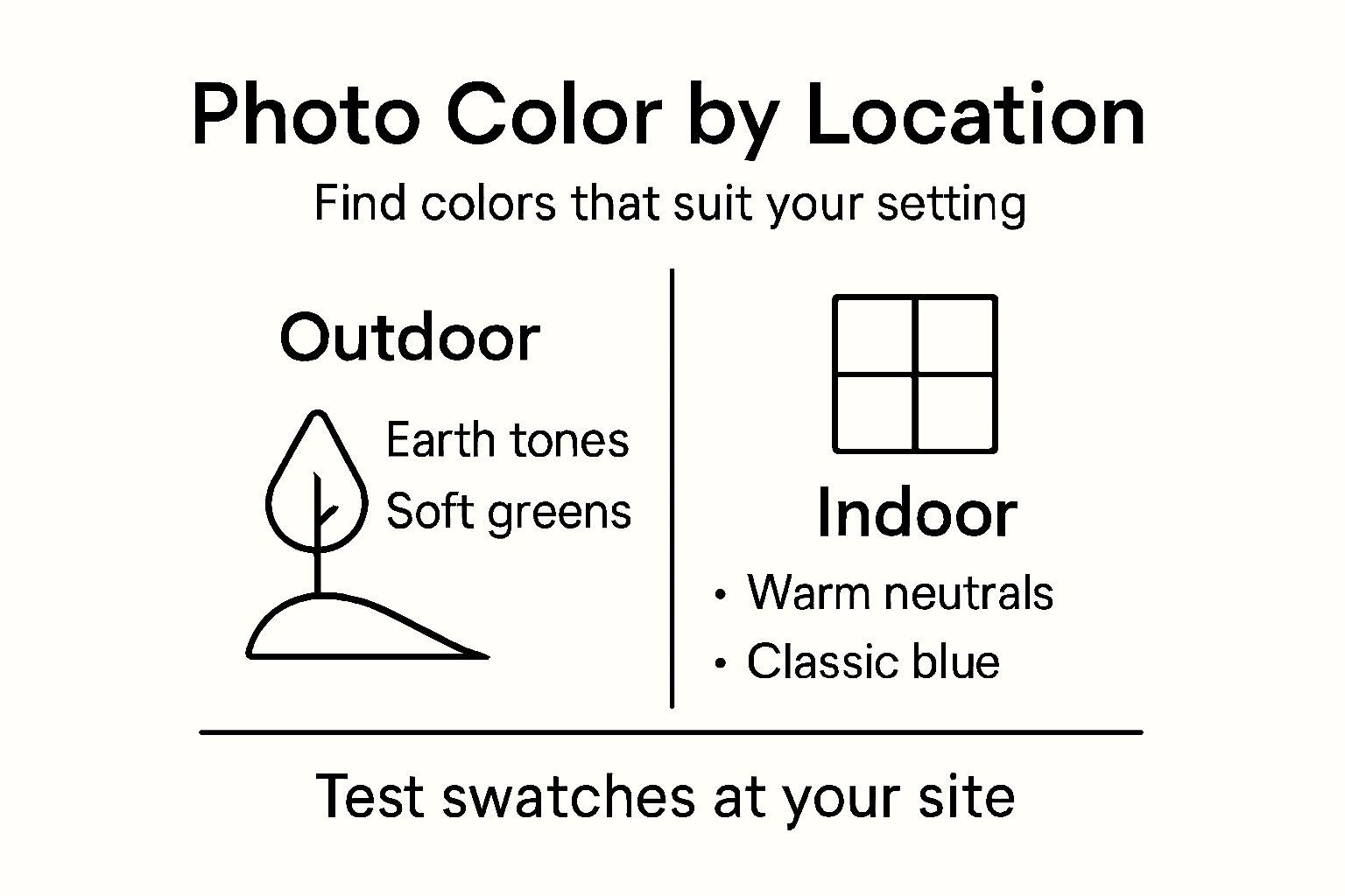
Color considerations for different locations include:
- Urban environments: Muted tones, grays, and structured neutrals
- Forest/woodland settings: Earthy greens, warm browns, soft blues
- Beach locations: Soft pastels, white, light blues, sandy neutrals
- Mountain landscapes: Deep blues, rich greens, rust colors
- Indoor studio: Neutral tones with strategic accent colors
Successful location-based color choices prevent subjects from blending into backgrounds while maintaining a natural, cohesive aesthetic. Strategic color selection involves understanding how different hues interact with ambient light, background textures, and environmental tones. Professional photographers carefully balance color saturation, brightness, and contrast to create visually compelling narratives.
Location is not just a backdrop—it’s a critical character in your family’s visual story.
Pro tip: Scout your photo location beforehand and bring fabric swatches to test how colors interact with the specific environment’s lighting and background.
Common color mistakes to avoid
Successful family photography hinges on avoiding critical color selection errors that can undermine the entire portrait’s visual impact. Color strategy requires thoughtful planning and an understanding of potential pitfalls that can diminish photographic quality.
Professionals recognize family photo color challenges that can compromise image aesthetics. Understanding these common mistakes helps families create more compelling, timeless portraits that genuinely reflect their unique dynamics.
Top color mistakes to avoid include:
- Wearing overly bright or neon colors that distract from subjects
- Selecting colors that clash with skin undertones
- Using too many competing colors in a single image
- Ignoring background color interactions
- Matching outfits too precisely, eliminating individual personality
- Failing to consider lighting conditions and color perception
Skin tone compatibility is particularly crucial in color selection. Unflattering color choices can wash out complexions or create unnatural shadows, requiring extensive post-processing correction. Professional photographers recommend understanding individual skin undertones and selecting colors that enhance natural coloration.
Color mistakes can transform a potential masterpiece into a forgettable photograph.
Pro tip: Bring fabric swatches and test colors against your skin in the intended photographic lighting to ensure the most flattering results.
Capture Your Family’s True Colors with Expert Guidance
Choosing the best color scheme for your family photos can feel overwhelming. The challenge lies in balancing individual skin tones, coordinating outfits without matching exactly, and selecting seasonal palettes that enhance natural beauty and emotional storytelling. These key points affect the timelessness and authenticity of your portraits. If you want to avoid common color mistakes and create photos full of warmth and vibrancy you will cherish forever explore how professional insight makes all the difference.

Ready to turn your color choices into compelling visual stories? Visit Uncategorized | Jodi Blodgett Photography to discover expert tips and see real examples of families styled to perfection. Experience personalized sessions with Jodi, a passionate photographer in Massachusetts, Connecticut, and Rhode Island, who understands how color and location blend to create breathtaking images. Book your session today at Jodi Blodgett Photography and make your family portraits truly timeless.
Frequently Asked Questions
What colors should I avoid for family photos?
Avoid overly bright or neon colors that can distract from your family’s features, as well as colors that clash with individual skin tones and overly matching outfits that eliminate personal expression.
How do seasonal palettes impact family photo color choices?
Seasonal palettes influence the emotional tone and aesthetics of portraits. For instance, warm earth tones are ideal for autumn, while soft pastels work best in spring, creating a cohesive and flattering look.
Should I match outfits or coordinate colors for family photos?
Coordinating colors is generally more effective than matching. It allows individual personalities to shine while maintaining visual harmony. Choose a primary color palette with 2-3 complementary shades for the best results.
How can location affect color selection for family portraits?
Location greatly impacts color selection. Urban settings may benefit from muted tones, while natural environments like beaches or forests work well with earthy or soft color palettes. It’s essential to consider how colors will interact with the background and lighting.