")

TL;DR:
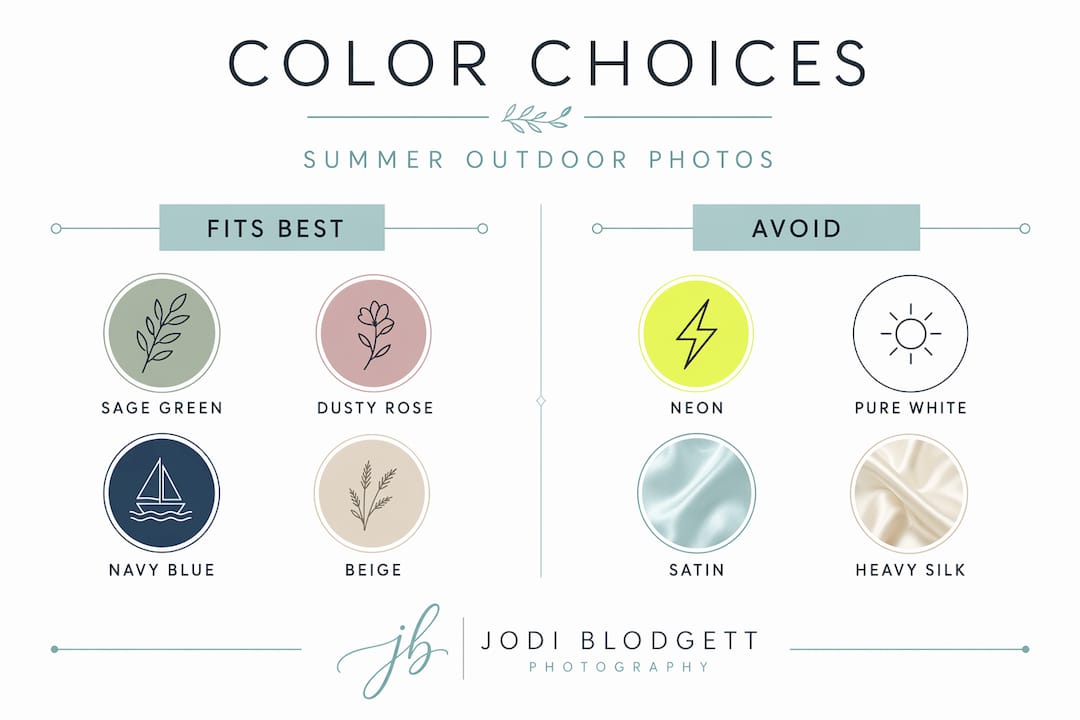
- Choosing medium-value tones like navy, sage, and dusty rose ensures outdoor summer photos capture detail and flatter all skin tones. Bright neons, pure white in harsh sunlight, large patterns, and dark fabrics can cause overexposure, color casts, or loss of detail, making them poor choices. Coordinating outfits around 2-3 harmonious shades and considering the environment and lighting enhances natural, timeless summer portraits.
Choosing the best colors to wear for pictures outdoors in summer sounds simple until you see the photos and realize your favorite bright outfit made you look washed out, neon-lit, or completely lost against a green park backdrop. Most people assume summer calls for bold, saturated colors. That instinct costs them great photos. The colors that look vibrant on a store rack often behave very differently once they hit direct sunlight, compete with lush green grass, or reflect off your skin in unflattering ways. Here is what actually works, and why.
Table of Contents
- Key Takeaways
- Best colors to wear for pictures outdoors in summer
- Colors and fabrics to avoid for summer photos
- How to coordinate colors for individuals and families
- Adapting colors to summer settings and lighting
- My honest take on color mistakes I see every session
- Plan your summer session with expert color guidance
- FAQ
Key Takeaways
| Point | Details |
|---|---|
| Medium-value tones win | Colors like navy, sage, and dusty rose hold detail in both highlights and shadows better than extremes. |
| Avoid neon and pure white in direct sun | Neons cast unnatural color onto skin; white overexposes easily outside of golden hour or shade. |
| Limit your palette to 2-3 shades | More than two or three saturated colors in a group pulls attention away from faces. |
| Match colors to your setting | Beach, forest, and open field each call for different color families to keep subjects from blending in. |
| Fabric matters as much as color | Breathable linen and cotton photograph cleanly and keep everyone comfortable in summer heat. |
Best colors to wear for pictures outdoors in summer
Not all photogenic colors are created equal. Some color families consistently deliver across different skin tones, lighting conditions, and summer environments. Understanding why they work helps you make smarter choices beyond just copying a list.
Soft neutrals
Soft neutrals like cream, beige, and light gray are the most reliably photogenic colors for outdoor summer portraits. They reflect light evenly rather than absorbing or bouncing it harshly, which flatters every skin tone without creating contrast problems. They also sit quietly against natural backgrounds, letting faces take center stage. Think of them as the foundation of any photo-ready outfit.
Muted earth tones
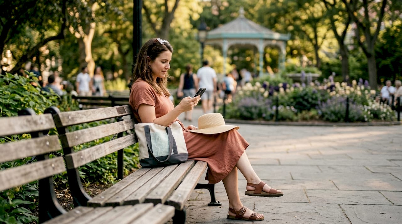
Sage green, dusty rose, terracotta, and olive are among the best outdoor photo outfits colors because they harmonize naturally with summer environments. When the setting is full of greens and warm light, these tones feel like they belong. They do not fight the background; they complete it. A dusty rose dress in golden hour light looks effortless precisely because the colors are speaking the same warm language.
Pastels and deep blues
Soft pastels like blush, light blue, lavender, and soft yellow bring a fresh, airy quality to summer photos without the overexposure risk of pure white. They are gentle on the eye and particularly flattering in open shade. Navy and deep denim add visual weight and grounding, which is especially useful in group shots where you need some outfits to anchor the frame without overpowering others. For best colors for family pictures outside, pairing a navy piece with cream and a soft accent creates a polished, timeless combination.
Why medium-value tones are the real secret
Medium-value tones like navy, sage, dusty rose, and tan hold detail in both highlights and shadows, making them ideal for outdoor summer photos where light is rarely perfectly controlled. Very light colors risk overexposure in direct sun. Very dark colors lose texture and detail. Medium tones live in the sweet spot.
Pro Tip: If you are unsure whether a color reads as medium-value, photograph it against a white wall in natural light on your phone. If you can clearly see the fabric texture and color depth, it will photograph well outdoors.
Colors and fabrics to avoid for summer photos
Knowing what not to wear is just as useful as knowing what to wear. Several color and fabric choices reliably cause problems in summer outdoor photography, and most clients do not realize this until after the session.
Colors that create real problems:
- Neon shades of any color. Neon colors reflect colored light onto skin creating unnatural color casts that are difficult to correct in post-production. A neon yellow shirt will literally cast yellow light on the faces nearby. No amount of editing fully fixes it.
- Bright pure white in direct sun. White reflects sunlight like a mirror and can blow out skin tones in harsh afternoon light. Warm white and ivory are far safer choices, and even pure white works beautifully during golden hour or in open shade.
- Pure black in bright sun. Black absorbs heat, which makes for a miserable session on a hot day. More importantly, very dark colors lose texture and detail in direct sunlight, leaving you with flat, lifeless-looking fabric in photos.
- Large bold patterns and very busy prints. These pull the viewer’s eye away from faces and create a chaotic feel, especially in group shots. Small, subtle patterns in muted tones are fine.
- Very pale pastels in full sun. These wash out easily and can lose their color entirely, reading as near-white in the final image.
Fabrics to reconsider:
Satin and heavy silk reflect sweat and cling to skin in summer heat, which shows in photos in ways that are hard to overlook. Breathable fabrics like cotton, linen, and soft jersey keep everyone comfortable and photograph cleanly. Chiffon and crepe are also excellent for summer because they move beautifully in light breeze shots and stay comfortable in heat.
Pro Tip: Always do a quick test by wearing your planned outfit outside in similar light conditions before the session. What looks great indoors can behave very differently in bright summer sun.
How to coordinate colors for individuals and families
The goal of coordination is harmony, not uniformity. Wearing identical outfits in a group photo signals effort in the wrong direction. What you want is for every person’s outfit to feel like it belongs in the same frame. Here is how to get there:
- Choose a primary color anchor first. Pick one color that will be the dominant tone in your group palette, typically a neutral like cream, navy, or sage. Build everything else around it.
- Add one or two accent colors. Select complementary shades that share the same warmth level as your anchor. Warm tones (cream, rust, terracotta, dusty rose) work together. Cool tones (navy, gray, lavender, soft blue) work together. Mixing warm and cool without intention creates visual tension in photos.
- Limit saturated colors to one or two pieces. Wearing three or more bright saturated colors creates distraction from faces. If someone wants to wear a bolder shade, balance it with neutrals elsewhere in the group.
- Use texture to add depth without adding more color. A linen blazer in the same cream tone as a cotton dress creates visual variety through texture rather than competing hues. This technique keeps groups looking polished without looking staged.
- Test your combination together before the session. Lay the outfits out on a bed and photograph them together. If they look harmonious in that test photo, they will likely work in the actual session.
Color palettes that harmonize, like navy with cream and dusty rose or olive green with cream and rust, create natural, timeless looks precisely because the colors share a warmth level and support each other rather than compete. For more detailed guidance on putting a group look together, the summer outfit style guide at Jodiblodgettphotography walks through specific combinations that work in New England settings.
Pro Tip: Accessories count. A rust-colored scarf or a pair of tan sandals can tie an outfit into the group palette without changing the whole look. Small accents go a long way in photos.
Adapting colors to summer settings and lighting
The right color for a beach session is not necessarily the right color for a forest shoot. Your environment is part of the photo, and your clothing colors need to work with it. Here is a quick reference:
| Setting | Colors that work | Colors to avoid |
|---|---|---|
| Beach and oceanside | Soft blues, warm whites, cream, blush, linen tones | Bright white in direct sun, heavy darks |
| Parks and green grass | Earth tones, rust, dusty rose, navy, cream | Bright greens that blend into grass |
| Open fields and wildflowers | Muted neutrals, soft pastels, ivory | Busy floral prints, bright saturated colors |
| Forests and wooded areas | Deep greens, rust, brown, warm neutrals | Very pale pastels, black in dark shade |
| Golden hour (any setting) | Terracotta, dusty rose, cream, warm white, tan | Cool blues, gray, and stark black |
Avoiding colors that compete directly with the natural environment helps subjects stand out authentically. A bright green outfit in a grassy park is a common mistake. The outfit blends with the background and the person effectively disappears into the scenery.
Fabric matters here too. At the beach, chiffon, linen, or crepe outperform satin and heavy silk because they do not reflect sweat, they move well in ocean breezes, and they stay comfortable during longer outdoor sessions. For wooded or park settings, cotton and jersey are ideal since they handle movement naturally and photograph without unwanted sheen.
The timing of your session also changes what colors perform best. In the harsh light of midday, medium-value tones protect you from overexposure and shadow problems. In golden hour, warm tones amplify the magic in the light. Scheduling your session for the hour before sunset gives every color palette a better starting point.
My honest take on color mistakes I see every session
I have photographed enough summer sessions to notice a consistent pattern. The families who overthink matching end up with outfits that feel stiff. The ones who ignore coordination entirely often end up with chaotic group photos where no one knows where to look. The sweet spot is in the middle, and it is not as hard to find as people think.
What I find most underrated is the power of medium-value tones. Clients almost never walk in saying “I want to wear sage” or “let’s try terracotta.” But when I suggest those colors based on their setting and the time of day, the results consistently outperform sessions where someone insisted on the white linen outfit they loved on Pinterest. White is beautiful in the right conditions. At 2 p.m. in direct Massachusetts summer sun, it is a recipe for overexposed chaos.
The other thing I have learned? Comfort is a color decision too. When someone is visibly hot and uncomfortable in dark fabric that is absorbing July heat, it shows in their expressions. Breathable, photo-friendly fabrics in thoughtful colors produce better photographs because the people in them are actually at ease.
Coordination is about harmony, not uniforms. When each person’s outfit feels like it was chosen with the others in mind, the whole frame reads as intentional and warm. That is what makes a family photo feel timeless rather than dated three years later.
— Andrew
Plan your summer session with expert color guidance
Getting color right before your session saves everyone time and produces photos worth printing. At Jodiblodgettphotography, every client receives personalized guidance on outfit colors, coordination, and fabric choices tailored to their specific location, lighting, and session timing.

Whether you are planning a family session on the New England coast, a golden hour shoot in a local park, or an engagement session in a wooded setting, Jodi works with you to make sure your outfits and the environment work together. The result is photos that feel natural, vibrant, and genuinely yours. Ready to start planning? Book your session and get outfit advice built into the process from the start.
FAQ
What are the best colors to wear for outdoor summer photos?
Soft neutrals like cream and beige, muted earth tones like sage and dusty rose, and medium-value blues like navy consistently produce the most flattering results in outdoor summer photography because they interact well with natural light and backgrounds.
Should you wear white to an outdoor summer photo session?
White works best during golden hour or in open shade. In direct midday sun, white overexposes easily and can blow out skin tones, so warm white or ivory is a safer choice for most summer sessions.
What colors should families avoid for outdoor summer photos?
Avoid neon shades, pure bright white in direct sun, and large busy patterns. Neons reflect colored light onto skin and create color casts that are very difficult to fix in editing.
How many colors should a family wear in outdoor photos?
Limit your palette to 2-3 coordinated shades to keep the focus on faces rather than clothing. Choose colors within the same warmth level to create natural harmony without everyone wearing identical outfits.
Does the location affect what colors to wear for summer photos?
Yes, significantly. Beach sessions favor soft blues and warm whites; park sessions call for earth tones rather than greens that blend into grass; and golden hour sessions are amplified by warm tones like terracotta, dusty rose, and cream rather than cool blues or gray.
Recommended
- 7 Best Color Schemes for Family Pictures Outside | Jodi Blodgett Photography
- Family Photo Outfit Ideas Summer: Create Stunning Looks Easily | Jodi Blodgett Photography
- Best Color for Family Photos: Create Timeless Portraits | Jodi Blodgett Photography
- What to Wear Family Photos: Style Ideas for 2025 Sessions | Jodi Blodgett Photography